
In this tutorial we’ll be using Adjustment Layers to color the line art. Adjustment layers are one of the most powerful, and probably least used, features of Photoshop. To create an adjustment layer, open your layers pallet and click on the half-black/half-white circle at the bottom of the pallet. In this tutorial we’ll only be using the first option, solid color (See the image below).
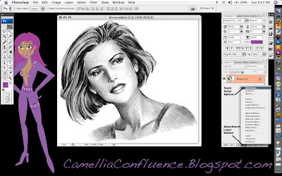
More on adjustment layers later. Open your line art in Photoshop. (The source image and a copy of the Illustrator Skin Tones Swatch are included at the end of the tutorial. If you wish to follow along with those images, scroll down and Right+Click on each image and select Save As). Make sure the image is in RGB mode (Image -> Mode -> RGB Color) before we begin.
The first thing we’re going to do is preserve the details of the lines in a separate layer using an alpha channel. To do this, select the background layer in the layers pallet. The Select All (Cmd+A) (Note: I’ll be using Mac shortcut commands in this tutorial. If you’re using a PC, use the Ctl key instead of the Cmd key). Then copy the selection using Cmd+C.
Now, Cmd+Click on the Alpha 1 channel icon and anything white will be selected. In order to be able to select the black lines, we need to invert the image, or flip-flop the colors. Use Cmd+D to drop the selection, then Select All, Cmd+A, and use the Image -> Image -> Adjsutments -> Invert (Cmd+I) and the image will be inverted. Cmd+Click on the layer again to select the white lines.
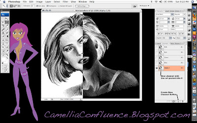 Now, switch back to the layers pallet and click on the background layer. In the layers pallet, create a new layer by clicking on the Create Layer icon at the bottom of the pallet. The new layer will be called Layer 1 by default. You can double-click on the layer name to rename it. I renamed my Layer “Solid Lines.”
Now select Edit -> Fill and choose Black from the pull-menu in the Contents portion of the dialogue.
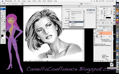
You can click on the “Eye” icon on the background layer to turn it on and off in order to better see what the “Solid Lines” layer actually consists of.
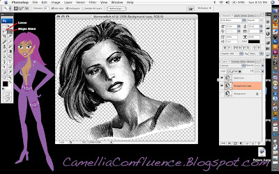
You can also use the “New Layer Icon” to duplicate an existing layer. For the next step, we need to duplicate the background layer. So Click+Drag the background layer onto the “New Layer Icon.” The layer created will be called “Background copy.” I left the name unchanged for the tutorial, because that’s what I would have called the layer anyway.
The final preparation step before painting is to remove the white background from the “Background copy” layer. Use the Magic Wand and Lasso selection tools for this step. Then delete the selected areas.
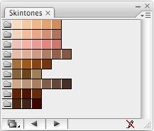
Now, we’ll start adding color one layer at a time. I always begin with the flesh layer. I have a screenshot of the Adobe Illustrator skin tones color swatches I keep hand. I used the eyedropper tool to sample one of the flesh tones.
Once you have your color chosen, selected the adjustment layers icon (the half-black/half-white circle at the bottom of the layers pallet) and chose the Solid Color option (the first one) from the pop-up menu. By default, the color of the adjustment layer is the same as the foreground color. See the image below.
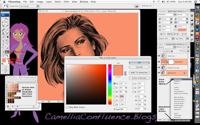
Solid color adjustment layers act like a mask. Any portion of the layer that is white appears as a solid color, Anything black is completely masked. Shades of gray allow a portion of the color to show through.
Now, if you notice in the screenshot above, the entire layer is flesh colored. That’s because the layer is filled with white. Now Select All (Cmd+A) and then Edit -> Fill and use Black.
The adjustment layer now becomes completely transparent. In order to get the color to show through, we have to use the Paint Brush tool and paint in areas of white where the flesh is. In the image below, I’ve painted portions of the flesh and drawn a white to black gradient in a rectangular selection marquee. Look at the gradient and you’ll notice how shades of gray reveal increasingly transparent shades of the flesh color.
Remember though, we want the detail in the background image to show through as well. So change the Layer Mode to Multiply to reveal this detail.
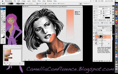 Now, go ahead and paint in the entire flesh area. Use a larger brush size on large areas and decrease the brush size in areas where detail is critical, like around the eyes and lips.
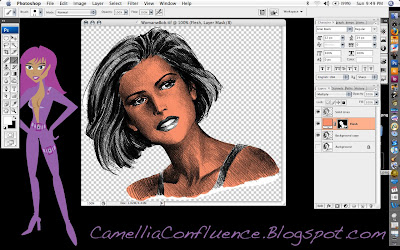 Some things to know about adjustment layers:
1. If you paint into an area accidentally, switch the foreground color to black and paint over the mistake. The black paint will act like the eraser tool in a mask.
2. What if you don’t like the color you just painted in? No need to worry, this is one of the strengths of adjustment layers. Just double click on the layer thumbnail and a color picker will pop up. Select whatever color you want. You can change it as much as you want and it will not affect any other layer in the image. (See screenshot below.)
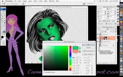
Now, keep adding Solid Color Adjustment Layers for each color you want to add to the line art.
Steps in making a new Solid Color Adjustment Layer:
1. Click on the Adjustment Layer Icon on the bottom of the Layers Pallet.
2. Select Solid Color option
3. Choose your color from the color picker
4. Rename the layer (I use Eyes, Lips, Hair, etc.)
5. Change the layer mode to Multiply
6. Fill the layer with black
7. Paint the areas you want to be in color with white using the Paint Brush Tool.
When you are finished, your colored line art will look similar to the one I did below.
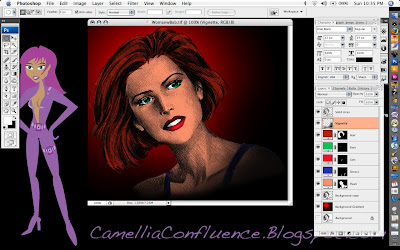 To finish off the picture you may want to make some adjustments to the Solid Lines layer. In the image above, I changed the mode to Multiply and reduced the opacity to 67 percent so the solid lines weren’t so overpowering.
I used a red and black circular gradient to provide a simple background as well. To give the clip art a vignette look, I airbrushed the lower right corner in a very thin layer of black using a 300-pixel brush with 0 percent hardness and 30 percent flow. This is the Vignette layer just below the Solid Lines Layer in the screenshot.
You’ll also have some pesky white areas on the “Background copy” layer. I used the Brush Eraser tool with a 20-pixel radius and 0 percent hardness to carefully erase those areas.
Original Source File:

Adobe Illustrator Skintones Swatch:


1 comment:
You write very well.
Post a Comment