Friday, July 10, 2009

Lilies in July


I'm finally back into a regular routine and I'm not having to work on several different projects at once. I did have a good amount of time to get out and shoot during June, I just didn't have the time to sit down at a desk and begin the process of weeding out the bad images and post processing what remained after the cuts.

I had a chance last night to clean off all my CF cards, so I started the culling process there. I took the photo of the lily above on July 4th while visiting my mother on the holiday. It was good to go back to for a family visit and get some good, Mom-cooked meals. My mother and her brother live next door to each other and always have a wide variety of flowers in their yards. I had hope to shoot a lot of them, but the heat had withered just about every flower in their yards to the point they weren't very photogenic.

I got lucky with the lily though. As I was walking in my Mom's house, I noticed a lily on the verge of blooming. By Saturday afternoon it had blossomed and I was able to get some shots of it before the heat took its toll on the poor flower.

My Mother says the flower is a Tiger Lily (Lilium columbianum), but I believe it's actually a Turk's Cap Lily (Lilium superbum). Even though both flowers are very similar in appearance, the Tiger Lily is native to the western United States and the Turk's Cap Lily is native to the central and eastern United States.


Tuesday, June 2, 2009

Freemind


I've been working on several writing projects lately and came across an open source planning application I've been using for character development and plotting. The screen shot above is a long-term project I've been working on for a while now called Colony. I've been using Freemind to make notes on the characters as I'm developing them.

The nice thing about Freemind is that the nodes can be clicked to collapse or expand them. This allows me to put a great deal of information into nodes and still be able to keep the overall project compact by collapsing the nodes I'm not working on. It's also very easy to edit nodes and moved them around in the overall project. If the node trees start becoming too complex, they can be cut and pasted into a new document. There is also a very wide range of node icons (on the left of the screen shot) that can be used to easily identify related entries indifferent trees. For example, the light bulb in the screen shot is used to show a relationship between Pax and Madelyn.

Freemind is a little quirky when you first use it, but once you get the hang of the interface, it's a really simple application to use. You can download Freemind from the Wiki. Installation is a very simple matter and you can have the application up and running in minutes.

I highly encourage anyone that needs a mapping application to give Freemind a try.

Monday, May 18, 2009

An Unexpected Absence

I had planned to be a lot more active with this blog in 2009, but it seems like something was always popping up unexpectedly. I did a lot of freelance photography for a community theater, a lot of programs and promotional material for The Brundidge Historical Society, the Pike Piddlers' Storytelling Festival and shot a lot of class reunions. The days slipped by and before I realized it, it was May already.

I'm past most of the freelance work I do during the year, so I'll begin to post more frequently. I had originally planned to to post on regular schedule, but that's just isn't going to work out too well. I'll be writing a few
Photoshop, Illustrator and photography tutorials.

There are two projects I've been working on during the past three to four months. The first is a four-panel cartoon series I've been working on titled "Life as a
Wallbanger." I've got the script and thumbnails for 80 panels comeplete and I'm working on finalizing the first 10 installments now.

The second is a series of speculative science fiction
short stories in a collection I'm calling "2028." I'll be posting draft one of "The Remains of Spring" before the end of the month. I have a few more plotting issues to work out before I begin working on rewrites. The second story is titled "Ambient Light" and follows an unfortuante day-in-the-life of a freelance photographer trying to survive in a cutthroat world of corporate news media.

I have a third project in development in the 2028 collection called "
Redline Marionettes." It's a one issue comic book about a corporate "asset recovery" team that screws up a recovery operation.

Finally, but most importantly, I'll be posting a lot of
HDR work I've done lately.

Sunday, January 11, 2009

RAW vs. JPEG

I wanted to start off my photography tutorial series by discussing the two most widely used file formats for digital images. JPEG is the most widely used and the default format for most digital cameras. RAW is a newer, manufacturer proprietary, file.

There are advantages and drawbacks, which I'll discuss in a moment, to shooting in either format. I shoot in both formats, depending on the situation. For my landscapes, portraits or any other subject I plan to do extensive post-processing, I always shoot RAW. Anything I shoot that I want to be able to make prints straight from my CF cards, I shoot in JPEG.

Let's start, by looking at JPEG
• JPEG is a universal image format and is readable by any image processing program that supports the JPEG Format.
• JPEG is a lossy, compression format.
JPEG is a relatively small file size. An 8 mega pixel camera produces a file between 1 and 3 MB
• Your camera firmware does the image processing.
JPEG is lower in dynamic range, but higher in contrast
JPEG is a slightly sharper file.

JPEG stands for Joint Photographic Experts Group, which was a committee formed in 1986 to create a digital image compression format that would be used as an industry standard. A statement was issued in 1992 and approved in 1994 as ISO 10918-1. This ensures that your JPEG files will be readable by any device that supports the JPEG format — Kodak Photo Kiosks, digital picture frames, stand-alone photo printers, cell phones, computers, etc.

However, JPEG is a lossy compression format, meaning that come of the color and detail in the image are lost. When saved at a higher compression ratio — a larger file size — the loss in quality isn't noticeable to the human eye. I've made prints up to 11x14" that were very high quality. However, the loss in quality is apparent in 20x30" or larger prints.

To create a JPEG you digital camera has what it called firmware, or software that is part of the hardware inside the camera. It's this firmware that carries out all of the complex mathematical calculations required to create a JPEG file. The firmware processes three sets of compression algorithms and combines them to create the JPEG.

If you're not interested in the mathematics, just skip the next three paragraphs.

The first series of compression is lossy. The firmware converts the image to the YCbCr color space, which is the same color space as digital color television. The Y channel represents the brightness of the image and the Cb and CR channels represent the chrominance of the image. Humans see more detail in the brighter parts of the image than they can in the color of the image. So, the firmware down samples the three channels in a 4:2:2 ratio. What this means is that you lose a lot of color from the image in this step.

The next step in creating a JPEG involves two sets of compression called the Discrete Cosine Transformation. The DCT breaks the image into a series of 8x8 pixel grids and saves them in an array. For each 8x8 grouping, the pixel values are averaged, and the entire 8x8 pixel group is converted to the average value. This step results in loss of color and detail in the image. To complete the DCT, a lossless form of run-length compression called entropy coding is used. This coding takes a zig zag pattern across the image's DCT array from the top left to bottom right. The way the compression works is that if 10 8x8 pixel groups in the array have the same pixel value, it compresses these 10 groups into one unit. The end result of this step is an extremely small JPEG file.

The end result is that you have high quality JPEG files that can be printed up to 11x14" with no noticeable image quality loss. You JPEG files are also written in an industry standard format, so any device supporting the format can read it. The files are also much smaller, so you can save more pictures in less space.

The drawback is that you have lost so much data during compression, you're very limited in the amount of post processing you can do to correct mistakes you made while capturing the image.

Now, let's look at RAW
• RAW is not an actual image file, it’s usually a camera manufacturer’s proprietary format and requires special software to view the file. When cameras with RAW first hit the market, it was very difficult to find software to read the file. Today, getting hold of that software is relatively easy, and in most cases free. Adobe Photoshop CS2, CS3 and Photoshop Elements 3.0 and later have RAW conversion software built into the application.
• RAW is an uncompressed, loss less file. The camera records all of the sensor data, so if you have and 8 mega pixel camera, it will produce an 8 MB RAW file.
• RAW captures a wider dynamic range — meaning more detail in the highlights and shadows.
• RAW is lower in contrast and not as sharp.
• RAW files are read only and require post-processing. The post processing information is recorded in an XMP file that accompanies the RAW file.

RAW isn't an actual image file, it's a record of all of the data a digital camera's sensor recorded. You need special software, like Adobe Photoshop CS3, to convert this data into an image and to do any additional post processing.

The main advantage of RAW is that you have all of the sensor data, giving you complete control over the processing of your image. I'm going to explore these options deeper in a tutorial on using Photoshop CS3's RAW converter.

The downside, like I said, is that RAW is not an industry standard format, so 10 or 15 years from now, you may not be able to find any software to read these files. You can't print or use RAW files with commercial products like Kodak Photo Kiosks, digital picture frames, stand-alone photo printers, cell phones, computers, etc. — the same products that readily accept JPEG.

I recommend converting all your RAW files to a lossless, industry standard format, like TIFF, and saving them on a backup hard drive or Compact Disc. When doing this, self-edit your images very, very hard and toss out any images that aren't up to your standards.

RAW are also exceptionally large files, so it takes longer to write them to the CF card and you get far fewer files per card compared to JPEG. This will cut your frame rate dramatically if you're shooting in bursts because your camera's buffer will fill up and prevent you from shooting anymore images. This makes RAW a very bad option for shooting sports or events where you will be taking a lot of pictures at a very fast rate.

Overall, RAW gives you complete creative control, but JPEG is the more practical shooting format.

Sunday, January 4, 2009

Creating and Applying Photographic Textures


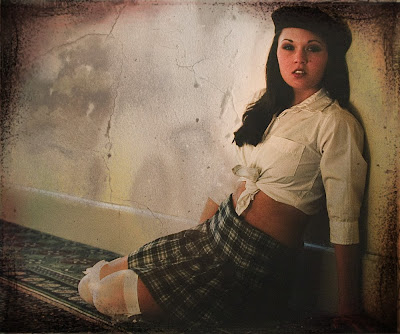
A texture is a photograph that consists entirely of structurally interwoven elements. For example a close up of a brick wall, or a close up of cracks in the sidewalk. Using Photoshop, a texture can be combined with another photograph to give it additional depth and richness.

There are dozens of free photographic textures available on the web. But, I find most of them aren't the best quality and many of them are too texture heavy.

Fortunately, it's very easy to build up a good library of textures fairly easy. All you need is your camera and a few hours to wonder around town looking for any texture that catches your eye. I've found the best places to find good, quality textures is on old structures that have been weathered extensively.

Look for old brick buildings, stucco walls, doors with peeling paint, etc. Once you find a texture you like, set up a tripod and shoot a series of bracketed exposures. I usually shoot +1/-1 EV. This will give you three exposures of each texture. When using textures, it is possible you may want to use an under- or over-exposed texture because it will give you a better blend when you apply the texture to a photo. When saving your textures into a library, I recommend keeping the image the same size and dpi as it was originally captured. That way, you can resize the textures as needed when using them in other projects.


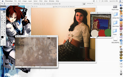
The screen shot above shows the original texture and photograph I used to make the image shown at the beginning of the tutorial. The texture photograph was made from a concrete covered brick wall in an ally behind The Grenville Advocate. I took the photograph of the model several years ago on Fuji Provia film at a photography seminar. I wanted my final image to have a film-grain feel to it, so I took a photograph of an 8"x10" print I had of the photo. Combining the texture and the image was a simple four-step process.

Step 1
Open your original image in Photoshop and use Image --> Image Size (Option-Command + I) to resize the canvas to your desired image size. Resize teh texture so that it is slightly larger than the image your working on.

Step 2
Select the entire canvas on the texture using Select --> All (Command +A) and Edit --> Copy (Command +C). Now, switch to your image and Edit --> Paste (Command + V) to paste the texture into a new layer. At this point, your texture will cover your image.


Step 3
Open the Layers Pallet (Window --> Layers or F7) and select the layer with your texture by clicking on it. At very top of the layers pallet, there is a pull down menu that is set to "Normal." This is the layer blending mode. Blending modes, simply, are methods of mixing layers without merging them. There are 24 different blending modes, but the primary modes you'll use are Multiply, Darken, Lighten, Screen, Overlay and Soft Light.

Switch between several of the blending modes until you find a blending effect that you like for your image. If you find the texture to be a little overpowering, you can reduce the opacity using the Opacity Slider the is to the right of the Blending Modes selection menu.

For my image, I used Darken mode and reduced the opacity to 69 percent.

Step 4
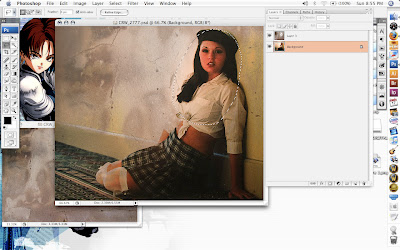
Now, you'll want to clean up your image. Most likely, you'll have some of the texture bleeding through on portions of the image you want to be seen more clearly. This is a simple matter of erasing portions of the texture so it doesn't affect the image below. Select the erasing tool and switch the mode to Brush from the pull down menu in the toolbar. Also in the toolbar, set the Flow to about 10 percent. For the brush, select a brush with a hardness of 0 so that you have really soft edges on the brush.

To finish things off, simply brush away the portions of the texture overlaying you image in an unappealing way. Since the Flow is set fairly low, you may have to make several passes to get the effect you want.

In my image, I erased portions of the texture shown by the marquee in the screenshot above. However, don't use the selection tool while you are erasing, it will give you hard lines where you erased. I just used it to show the area I erased the texture.

To complete the image I applied several more techniques I'll be writing tutorials on in the next three weeks.