Friday, July 10, 2009

Lilies in July


I'm finally back into a regular routine and I'm not having to work on several different projects at once. I did have a good amount of time to get out and shoot during June, I just didn't have the time to sit down at a desk and begin the process of weeding out the bad images and post processing what remained after the cuts.

I had a chance last night to clean off all my CF cards, so I started the culling process there. I took the photo of the lily above on July 4th while visiting my mother on the holiday. It was good to go back to for a family visit and get some good, Mom-cooked meals. My mother and her brother live next door to each other and always have a wide variety of flowers in their yards. I had hope to shoot a lot of them, but the heat had withered just about every flower in their yards to the point they weren't very photogenic.

I got lucky with the lily though. As I was walking in my Mom's house, I noticed a lily on the verge of blooming. By Saturday afternoon it had blossomed and I was able to get some shots of it before the heat took its toll on the poor flower.

My Mother says the flower is a Tiger Lily (Lilium columbianum), but I believe it's actually a Turk's Cap Lily (Lilium superbum). Even though both flowers are very similar in appearance, the Tiger Lily is native to the western United States and the Turk's Cap Lily is native to the central and eastern United States.


Tuesday, June 2, 2009

Freemind


I've been working on several writing projects lately and came across an open source planning application I've been using for character development and plotting. The screen shot above is a long-term project I've been working on for a while now called Colony. I've been using Freemind to make notes on the characters as I'm developing them.

The nice thing about Freemind is that the nodes can be clicked to collapse or expand them. This allows me to put a great deal of information into nodes and still be able to keep the overall project compact by collapsing the nodes I'm not working on. It's also very easy to edit nodes and moved them around in the overall project. If the node trees start becoming too complex, they can be cut and pasted into a new document. There is also a very wide range of node icons (on the left of the screen shot) that can be used to easily identify related entries indifferent trees. For example, the light bulb in the screen shot is used to show a relationship between Pax and Madelyn.

Freemind is a little quirky when you first use it, but once you get the hang of the interface, it's a really simple application to use. You can download Freemind from the Wiki. Installation is a very simple matter and you can have the application up and running in minutes.

I highly encourage anyone that needs a mapping application to give Freemind a try.

Monday, May 18, 2009

An Unexpected Absence

I had planned to be a lot more active with this blog in 2009, but it seems like something was always popping up unexpectedly. I did a lot of freelance photography for a community theater, a lot of programs and promotional material for The Brundidge Historical Society, the Pike Piddlers' Storytelling Festival and shot a lot of class reunions. The days slipped by and before I realized it, it was May already.

I'm past most of the freelance work I do during the year, so I'll begin to post more frequently. I had originally planned to to post on regular schedule, but that's just isn't going to work out too well. I'll be writing a few
Photoshop, Illustrator and photography tutorials.

There are two projects I've been working on during the past three to four months. The first is a four-panel cartoon series I've been working on titled "Life as a
Wallbanger." I've got the script and thumbnails for 80 panels comeplete and I'm working on finalizing the first 10 installments now.

The second is a series of speculative science fiction
short stories in a collection I'm calling "2028." I'll be posting draft one of "The Remains of Spring" before the end of the month. I have a few more plotting issues to work out before I begin working on rewrites. The second story is titled "Ambient Light" and follows an unfortuante day-in-the-life of a freelance photographer trying to survive in a cutthroat world of corporate news media.

I have a third project in development in the 2028 collection called "
Redline Marionettes." It's a one issue comic book about a corporate "asset recovery" team that screws up a recovery operation.

Finally, but most importantly, I'll be posting a lot of
HDR work I've done lately.

Sunday, January 11, 2009

RAW vs. JPEG

I wanted to start off my photography tutorial series by discussing the two most widely used file formats for digital images. JPEG is the most widely used and the default format for most digital cameras. RAW is a newer, manufacturer proprietary, file.

There are advantages and drawbacks, which I'll discuss in a moment, to shooting in either format. I shoot in both formats, depending on the situation. For my landscapes, portraits or any other subject I plan to do extensive post-processing, I always shoot RAW. Anything I shoot that I want to be able to make prints straight from my CF cards, I shoot in JPEG.

Let's start, by looking at JPEG
• JPEG is a universal image format and is readable by any image processing program that supports the JPEG Format.
• JPEG is a lossy, compression format.
JPEG is a relatively small file size. An 8 mega pixel camera produces a file between 1 and 3 MB
• Your camera firmware does the image processing.
JPEG is lower in dynamic range, but higher in contrast
JPEG is a slightly sharper file.

JPEG stands for Joint Photographic Experts Group, which was a committee formed in 1986 to create a digital image compression format that would be used as an industry standard. A statement was issued in 1992 and approved in 1994 as ISO 10918-1. This ensures that your JPEG files will be readable by any device that supports the JPEG format — Kodak Photo Kiosks, digital picture frames, stand-alone photo printers, cell phones, computers, etc.

However, JPEG is a lossy compression format, meaning that come of the color and detail in the image are lost. When saved at a higher compression ratio — a larger file size — the loss in quality isn't noticeable to the human eye. I've made prints up to 11x14" that were very high quality. However, the loss in quality is apparent in 20x30" or larger prints.

To create a JPEG you digital camera has what it called firmware, or software that is part of the hardware inside the camera. It's this firmware that carries out all of the complex mathematical calculations required to create a JPEG file. The firmware processes three sets of compression algorithms and combines them to create the JPEG.

If you're not interested in the mathematics, just skip the next three paragraphs.

The first series of compression is lossy. The firmware converts the image to the YCbCr color space, which is the same color space as digital color television. The Y channel represents the brightness of the image and the Cb and CR channels represent the chrominance of the image. Humans see more detail in the brighter parts of the image than they can in the color of the image. So, the firmware down samples the three channels in a 4:2:2 ratio. What this means is that you lose a lot of color from the image in this step.

The next step in creating a JPEG involves two sets of compression called the Discrete Cosine Transformation. The DCT breaks the image into a series of 8x8 pixel grids and saves them in an array. For each 8x8 grouping, the pixel values are averaged, and the entire 8x8 pixel group is converted to the average value. This step results in loss of color and detail in the image. To complete the DCT, a lossless form of run-length compression called entropy coding is used. This coding takes a zig zag pattern across the image's DCT array from the top left to bottom right. The way the compression works is that if 10 8x8 pixel groups in the array have the same pixel value, it compresses these 10 groups into one unit. The end result of this step is an extremely small JPEG file.

The end result is that you have high quality JPEG files that can be printed up to 11x14" with no noticeable image quality loss. You JPEG files are also written in an industry standard format, so any device supporting the format can read it. The files are also much smaller, so you can save more pictures in less space.

The drawback is that you have lost so much data during compression, you're very limited in the amount of post processing you can do to correct mistakes you made while capturing the image.

Now, let's look at RAW
• RAW is not an actual image file, it’s usually a camera manufacturer’s proprietary format and requires special software to view the file. When cameras with RAW first hit the market, it was very difficult to find software to read the file. Today, getting hold of that software is relatively easy, and in most cases free. Adobe Photoshop CS2, CS3 and Photoshop Elements 3.0 and later have RAW conversion software built into the application.
• RAW is an uncompressed, loss less file. The camera records all of the sensor data, so if you have and 8 mega pixel camera, it will produce an 8 MB RAW file.
• RAW captures a wider dynamic range — meaning more detail in the highlights and shadows.
• RAW is lower in contrast and not as sharp.
• RAW files are read only and require post-processing. The post processing information is recorded in an XMP file that accompanies the RAW file.

RAW isn't an actual image file, it's a record of all of the data a digital camera's sensor recorded. You need special software, like Adobe Photoshop CS3, to convert this data into an image and to do any additional post processing.

The main advantage of RAW is that you have all of the sensor data, giving you complete control over the processing of your image. I'm going to explore these options deeper in a tutorial on using Photoshop CS3's RAW converter.

The downside, like I said, is that RAW is not an industry standard format, so 10 or 15 years from now, you may not be able to find any software to read these files. You can't print or use RAW files with commercial products like Kodak Photo Kiosks, digital picture frames, stand-alone photo printers, cell phones, computers, etc. — the same products that readily accept JPEG.

I recommend converting all your RAW files to a lossless, industry standard format, like TIFF, and saving them on a backup hard drive or Compact Disc. When doing this, self-edit your images very, very hard and toss out any images that aren't up to your standards.

RAW are also exceptionally large files, so it takes longer to write them to the CF card and you get far fewer files per card compared to JPEG. This will cut your frame rate dramatically if you're shooting in bursts because your camera's buffer will fill up and prevent you from shooting anymore images. This makes RAW a very bad option for shooting sports or events where you will be taking a lot of pictures at a very fast rate.

Overall, RAW gives you complete creative control, but JPEG is the more practical shooting format.

Sunday, January 4, 2009

Creating and Applying Photographic Textures


A texture is a photograph that consists entirely of structurally interwoven elements. For example a close up of a brick wall, or a close up of cracks in the sidewalk. Using Photoshop, a texture can be combined with another photograph to give it additional depth and richness.

There are dozens of free photographic textures available on the web. But, I find most of them aren't the best quality and many of them are too texture heavy.

Fortunately, it's very easy to build up a good library of textures fairly easy. All you need is your camera and a few hours to wonder around town looking for any texture that catches your eye. I've found the best places to find good, quality textures is on old structures that have been weathered extensively.

Look for old brick buildings, stucco walls, doors with peeling paint, etc. Once you find a texture you like, set up a tripod and shoot a series of bracketed exposures. I usually shoot +1/-1 EV. This will give you three exposures of each texture. When using textures, it is possible you may want to use an under- or over-exposed texture because it will give you a better blend when you apply the texture to a photo. When saving your textures into a library, I recommend keeping the image the same size and dpi as it was originally captured. That way, you can resize the textures as needed when using them in other projects.


The screen shot above shows the original texture and photograph I used to make the image shown at the beginning of the tutorial. The texture photograph was made from a concrete covered brick wall in an ally behind The Grenville Advocate. I took the photograph of the model several years ago on Fuji Provia film at a photography seminar. I wanted my final image to have a film-grain feel to it, so I took a photograph of an 8"x10" print I had of the photo. Combining the texture and the image was a simple four-step process.

Step 1
Open your original image in Photoshop and use Image --> Image Size (Option-Command + I) to resize the canvas to your desired image size. Resize teh texture so that it is slightly larger than the image your working on.

Step 2
Select the entire canvas on the texture using Select --> All (Command +A) and Edit --> Copy (Command +C). Now, switch to your image and Edit --> Paste (Command + V) to paste the texture into a new layer. At this point, your texture will cover your image.


Step 3
Open the Layers Pallet (Window --> Layers or F7) and select the layer with your texture by clicking on it. At very top of the layers pallet, there is a pull down menu that is set to "Normal." This is the layer blending mode. Blending modes, simply, are methods of mixing layers without merging them. There are 24 different blending modes, but the primary modes you'll use are Multiply, Darken, Lighten, Screen, Overlay and Soft Light.

Switch between several of the blending modes until you find a blending effect that you like for your image. If you find the texture to be a little overpowering, you can reduce the opacity using the Opacity Slider the is to the right of the Blending Modes selection menu.

For my image, I used Darken mode and reduced the opacity to 69 percent.

Step 4
Now, you'll want to clean up your image. Most likely, you'll have some of the texture bleeding through on portions of the image you want to be seen more clearly. This is a simple matter of erasing portions of the texture so it doesn't affect the image below. Select the erasing tool and switch the mode to Brush from the pull down menu in the toolbar. Also in the toolbar, set the Flow to about 10 percent. For the brush, select a brush with a hardness of 0 so that you have really soft edges on the brush.

To finish things off, simply brush away the portions of the texture overlaying you image in an unappealing way. Since the Flow is set fairly low, you may have to make several passes to get the effect you want.

In my image, I erased portions of the texture shown by the marquee in the screenshot above. However, don't use the selection tool while you are erasing, it will give you hard lines where you erased. I just used it to show the area I erased the texture.

To complete the image I applied several more techniques I'll be writing tutorials on in the next three weeks.

Monday, December 29, 2008

2009 Photography Tutorial Series

This year, I'll post a weekly photography tutorial on Tuesday. I decided to write the tutorials because I believe it's always a good idea to review photography fundamentals, rules and techniques. When I review some of the very basics of photography and brush up on techniques I don't normally used very often, I found I get a lot of new ideas. I hope people will find these tutorials informative and useful.

The topics I will be covering for the first quarter of 2009:

January 2009
January 6, 2009: RAW vs. JPG
January 13, 2009: Aperture and Shutter Speed
January 20, 2009: The Sunny 16 Rule
January 27, 2009: Determining Exposure

February 2009
February 3, 2009: Selecting Equipment
February 10, 2009: Benefits of a Tripod
February 17, 2009: Essential Filters
February 24, 2009: Useful Gadgets

March 2009
March 3, 2009: Basic Composition
March 10, 2009: Image Power Points
March 17, 2009: Perspective
March 24, 2009: Depth of Field
March 31, 2009: High Dynamic Range (HDR) Images


2009 Artwork

For The Confluence, I bundled all my completed creative projects — Phototshop, Illustrator, Photographic Illustrations and Drawings — into a a general artwork category. All of my 2009 Artwork projects can be accessed through this page.

January
xxx


Notes:
2008 Archive

2008 Archive

2008 Blog Entries

Photography
This is a chronological listing of all posts I've made on photographic field trips, which I'm calling excursions.

January 2008
Jan. 12, 2008: Magnolia Cemetery
Jan. 12, 2008: Time Lapse Experiment #1
Jan. 21, 2008: HDR Headaches
Jan. 26, 2008: Pike Piddler's Storytelling Festival

February 2008
Feb. 2, 2008: Greenville & Georgiana
Feb. 14, 2008: Viscosity Experiment 001
Feb. 16, 2008: Greenville on Foot
Feb. 28, 2008: Gummy Bear Zen Masters

March 2008
March 15-16, 2008: Road to Cheaha
March 23, 2008: Brundidge to Greenville

September 2008
September 11, 2008: Commerce Street, Greenville
September 22, 2008: Magnolia Cemetery at Sunset

November 2008
November 7, 2008: Come Home It's Suppertime

December 2008
Sunday, December 7, 2008: Troy University Football
Sunday, December 7, 2008: Winter in Greenville

Notes:
Excursions Notes


###

Sunday, December 7, 2008

Winter in Greenville


I took drive around downtown Greenville late this afternoon to shoot a few shots. I wanted to concentrate on a winter in town theme. Since it was a bright, sunny day with a temperature around 50, I decided to concentrate on leaves and shadows.

The photo above was my favorite shot of the day. I find shadows to be an interesting subject to shoot. And this time of year is perfect for shooting shadows since the sun is lower on the horizon at this time of year.

Some more of the photos I took with the winter theme are on Flickr.

Troy University Football


Things are always busy at newspapers around Thanksgiving and Christmas because of all the additional seasonal advertising. So, it took me a couple of weeks to get around to sorting through all the photos from Troy University's homecoming game against Western Kentucky University. Troy Beat Arkansas State yesterday to win the Sun Belt Conference Championship outright. With the win the Trojans god a bid to the R+L Carrier Bowl in New Orleans Dec. 21.

I may try and make it to the game, but it's on an odd day of the work week, so I won't know how that is going to pan out with my work schedule. I probably won't get a holiday schedule until later this week.

I need to add a few additional game shots and the halftime and homecoming festivities to my set on flickr.com.

Sunday, November 23, 2008

Come Home, It's Suppertime


Every fall and spring, I shoot promotion photos for the Brundidge Historical Society's original folklife play, "Come Home, It's Suppertime." The play revolves around stories handed down from the Brundidge, Alabama, area during the Great Depression. Since it is a community theater production, the scenes in the play change during each season of performances based on who is available to perrform.

The photo above is from a new scene in which Rebecca Brown and Alexis Fraley learn to kiss from a "True Confessions" magazine.

The Brundidge Historical Society will also be presenting Sheila Kay Adams for a "Tell it on the Mountain" Chrustmas storytelling Dec. 12 at the We Piddle Around Theater in Brundidge, Alabama; present the Pike Piddlers third annual Storytelling Festival Jan. 20-31, 2009, at the We Piddle Around Theater and Trojan Center Theater on the campus of Troy University; and Barbara Bates Smith as Ivy Rowe from Lee Smith's novel, "Young and Tender Ladies," June 11, 2009.

I posted several other photographs on Flickr.

See the Brundidge Historical Society's website for more information.

Thursday, September 25, 2008

Life as a Wallbanger: The Brats


The three characters in the wallpaper are Abbigale, Victoria and Elizabeth — The Brats in a four panel cartoon I'm developing called Life as a Wallbanger. It's about a dysfunctional family and centers around the life of the two-year-old, Harvey. Harvey's mission in life is to evade his evil sister, Victoria, rule his daycare and force the square peg into the round hole.

Victoria was the first character in the Wallbangers I designed. Her life ambition is to torment her brothers, bamboozle her parents and to use her friends in nefarious plots to rule middle school. Victoria always refers to herself in the third person and has two friends, Abbigale and Elizabeth, that follow her every order.

Abbigale and Elizabeth were designed to closely resemble Victoria and are really Victoria Wannabees, that's why all three characters look so similar. I wanted to focus on the wannabe aspect of Abbigale and Elizabeth, so their clothes will always match Victoria's exactly. They play a very minor role in the Wallabngers, so they don't appear very often. They apear early in the comic for introduction, After that, they appear mainly in support of Victoria's plans to rule middle school with an iron fist.

Victoria is the only character in the Wallbangers that has two versions. The evil version is shown in the wallpaper. Whenever Voctorial appears in the presence of her parents, she's drawn as a sweet little girl. In that version, her face is more round and her pony-tails are rounded and not drawn with sharp angles. She also has big doey eyes and there are no sharp angles anywhere on the character.

However, when she appears with other adults, she always appears in the evil version because other adults see her for what she really is, a spoiled little brat.

The three brats are the first characters introduced in the comic. They're bored and decide to take Harvey "Baby Bowling."

Monday, September 22, 2008

Magnolia Cemetery at Sunset


Sunday, I had to go in and do some work at The Greenville Advocate. I was leaving about 6:15 p.m. and saw some beautiful cloud formations. I decided to shoot some silhouettes of the grave markers in Magnolia Cemetery. The oldest part of the cemetery is tucked away in a wooded area, so the opportunity to shoot a silhouette is rare. There are only a couple of graves in a clearing overlooking the remainder of the cemetery that are clear of the treeline.

The cemetery is one of my favorite places to shoot in Greenville. The older section of the cemetery dates back to the Civil War era, possibly earlier. There was one particular grave marker that I'd wanted to shoot for a while. I was just waiting for a good sunset.

I shot around the cemetery while I waited for the sun to begin setting. When the sun started getting close to the top of the tree line, I set up my tripod and waited. After about 20 minutes, I started shooting. This shot was near the end of a sequence of about 40 shots spaced about 30 seconds apart.

The image is a tone-mapped RAW file. I had to boost the saturation a little more than normal because Picasa tends to flatten out images when they're uploaded to blogger.

Thursday, September 11, 2008

Commerce Street, Greenville


As I was leaving work last Monday I noticed a heavy thunder could was moving in over Commerce Street in Downtown Greenville. I managed to shoot off six or seven sets of bracketed exposures (-2/0/+2 Stops) and then used FDR Tools to merge everything into a HDR image.

That didn't work too well. The wind was blowing really bad and I got a lot of ghosting in the clouds and bushes on the left side of the frame. In the end, I ended up tone-mapping the middle exposure in one of the brackets to expose the buildings and bushes. I used the under exposed frame and tone-mapped the sky.

After that, I created a mask around the buildings and shrubs and erased the sky from the exposure with the building and shrubs. That allowed the sky on the layer below to show through.

After that I cleaned up some dust spots and removed a traffic light that was sticking up out of the middle of the bushes. It was a really distracting element because it went right through the middle of the dark cloud.

Overall, it took about three hours to finish the post processing on the merged photograph.

(Note: HDR imaging, DRI imaging and Tone Mapping require RAW image format. You can't technically create a HDR, DRI or tone-mapped image from a JPEG or any other file type. Only RAW format keeps all of the luminosity data when the image was taken. Other file types have algorithms that determine how much of the captured data is saved in order to compress the file before saving.)

Sunday, August 24, 2008

New Retro Style Cartoons


I picked up a copy of Christopher Hart's Cartoon Cool: How to Draw New Retro-Style Cartoons a couple of weeks ago. The style is based on cartoons from the 1950s and 190s, but has a more modern flair.

If you've seen any of the Erin Esurance commercials, you'll recognize the style. But, the style really reminds me of Betty Boop. The Betty Boop films ran from 1932-1932 and were produced my Max Fleischer and released by Paramount Pictures.

Betty was an overtly sexy character for three years, but restrictions placed on the motion picture industry regarding sexuality caused Betty Boop to be toned down.

However, she was the first and most famous animated sex symbol and still remains popular today.

I really like this style because it's fun to draw. But also because one of the mainstays of this style is that it is centered around a family or group of people that are self-centered, irreverent and dysfunctional. In that way it reminds me a lot of South Park.

All that aside, I'm still learning to draw the style. I've been following along with the examples and practicing. The scan from my sketchbook is some of the practice. I'm beginning to understand how this style is drawn. I'm planning to start developing my own characters soon for a comic strip entitled "Life as a Wallbanger." It's about a dysfunctional family "somewhere in America."

Thursday, August 21, 2008

Chooser of the Slain


I've always found the Valkyries from Norse Mythology rather interesting. Valkyries, minor female deities that served Odin, chose the souls of warriors killed in battle to take to Valhalla to fight beside Odin in Ragnarok.

I decided to create a rendition of a Valkyrie in Illustrator, and started with a concept of the Valkyrie looking over her right shoulder with a weapon in her right hand. I wanted the right shoulder open and her hair to flow so that it looked like she turned suddenly and looked at the viewer.

I work better with a photo reference for body positioning. But, my Comic Artists Reference didn't have a pose close to anything I wanted. After looking through dozens of anime magazines and manga and not finding a close approximation of the pose, I looked at anime wallpapers on the Internet.

I finally found a wallpaper of a character from Neo Ranga that was almost exactly the pose I had in mind. I worked up a rough sketch and refined it several times before I started adding details. Originally, the Valkyrie had armor, earrings and other jewelry. But, I developed a pretty elaborate body tattoo and decided to make the Valkyrie naked so all of the tattoos could be seen.

Her weapon was originally a recurve bow, but I changed it to an over sized boomerang. I decided on a boomerang because the Valkyrie could throw it and the boomerang would return with the soul of her chosen slain warrior. The boomerang also gave me a larger pallet to draw a pattern similar to her tattoos.

After I completed the drawing, I scanned it and did the inking and cell shading in Adobe Illustrator. I had done some work in Adobe Photoshop for the background. I created a star field for the night sky, but decided it overpowered the drawing. So decided to go with the original background from Illustrator.

My original Illustrator document is 11x14 because that's the largest size print I can have made locally. I resized it to make a wallpaper for my laptop, which is the wallpaper that accompanies this blog entry.

Total working time was about 30 hours to complete the project. It took me about two hours to draw it and about four hours in Illustrator. The rest of the time was spent developing the tattoo pattern and pattern on the boomerang. I did about 14 or 15 variations of the tattoos before I settled on something I really liked.

Wednesday, August 6, 2008

Shading Practice: Motoko


After a couple of weeks of practicing pencil shading, I decided to try and put everything together. I found a wallpaper of Aoyama Motoko from Love Hina. I need to get a better scanner. It did a really poor job of accurately copying the drawing.

It darkened a lot of the background and other parts of the drawing, the lines around the wristbands most notably. The scanner also blew out the highlights. I fiddled with the exposure on the scanner, but it didn't make much difference in any of the other scans.

I was pretty happy with the actual drawing, though there is a lot of room for improvement. I wasn't very happy with the way it scanned though.

Thursday, July 31, 2008

Chelsea in Electric Blue


Life in general has been pretty busy the last couple of weeks. None-the-less, I managed to squeeze in some work in Illustrator. For some reason, I'm kind of hooked on the style of artwork Esurance uses in its commercials.

It took me about four hours to complete the wallpaper. I based the girl, I'm calling her Chelsea, off of a rough sketch in my sketchbook. I scanned it in, placed it in Illustrator and then used the pen tool to trace it. About half of the time it took to finish the piece was spent on the hair. I t took me a while to reach a result I was happy with.

I'm going to let the project rest for a few days and then take a look at again. I'd like to add some more highlights to give it an extra dimension. And I'll probably use Photoshop to do some more detailed shading on the face.

Sunday, July 13, 2008

Coloring Line Art with Adjustment Layers


In this tutorial we’ll be using Adjustment Layers to color the line art. Adjustment layers are one of the most powerful, and probably least used, features of Photoshop. To create an adjustment layer, open your layers pallet and click on the half-black/half-white circle at the bottom of the pallet. In this tutorial we’ll only be using the first option, solid color (See the image below).
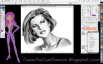


More on adjustment layers later. Open your line art in Photoshop. (The source image and a copy of the Illustrator Skin Tones Swatch are included at the end of the tutorial. If you wish to follow along with those images, scroll down and Right+Click on each image and select Save As). Make sure the image is in RGB mode (Image -> Mode -> RGB Color) before we begin.

The first thing we’re going to do is preserve the details of the lines in a separate layer using an alpha channel. To do this, select the background layer in the layers pallet. The Select All (Cmd+A) (Note: I’ll be using Mac shortcut commands in this tutorial. If you’re using a PC, use the Ctl key instead of the Cmd key). Then copy the selection using Cmd+C.

Now, Cmd+Click on the Alpha 1 channel icon and anything white will be selected. In order to be able to select the black lines, we need to invert the image, or flip-flop the colors. Use Cmd+D to drop the selection, then Select All, Cmd+A, and use the Image -> Image -> Adjsutments -> Invert (Cmd+I) and the image will be inverted. Cmd+Click on the layer again to select the white lines.
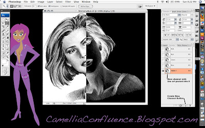

Now, switch back to the layers pallet and click on the background layer. In the layers pallet, create a new layer by clicking on the Create Layer icon at the bottom of the pallet. The new layer will be called Layer 1 by default. You can double-click on the layer name to rename it. I renamed my Layer “Solid Lines.”

Now select Edit -> Fill and choose Black from the pull-menu in the Contents portion of the dialogue.
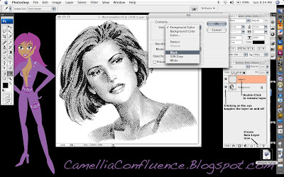

You can click on the “Eye” icon on the background layer to turn it on and off in order to better see what the “Solid Lines” layer actually consists of.

You can also use the “New Layer Icon” to duplicate an existing layer. For the next step, we need to duplicate the background layer. So Click+Drag the background layer onto the “New Layer Icon.” The layer created will be called “Background copy.” I left the name unchanged for the tutorial, because that’s what I would have called the layer anyway.

The final preparation step before painting is to remove the white background from the “Background copy” layer. Use the Magic Wand and Lasso selection tools for this step. Then delete the selected areas.
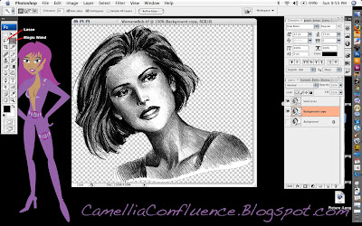

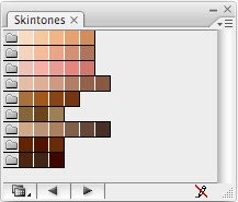
Now, we’ll start adding color one layer at a time. I always begin with the flesh layer. I have a screenshot of the Adobe Illustrator skin tones color swatches I keep hand. I used the eyedropper tool to sample one of the flesh tones.

Once you have your color chosen, selected the adjustment layers icon (the half-black/half-white circle at the bottom of the layers pallet) and chose the Solid Color option (the first one) from the pop-up menu. By default, the color of the adjustment layer is the same as the foreground color. See the image below.
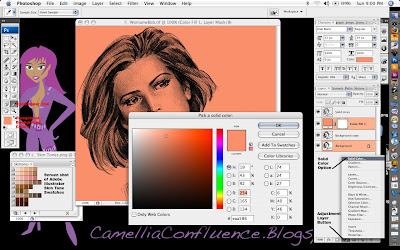

Solid color adjustment layers act like a mask. Any portion of the layer that is white appears as a solid color, Anything black is completely masked. Shades of gray allow a portion of the color to show through.

Now, if you notice in the screenshot above, the entire layer is flesh colored. That’s because the layer is filled with white. Now Select All (Cmd+A) and then Edit -> Fill and use Black.

The adjustment layer now becomes completely transparent. In order to get the color to show through, we have to use the Paint Brush tool and paint in areas of white where the flesh is. In the image below, I’ve painted portions of the flesh and drawn a white to black gradient in a rectangular selection marquee. Look at the gradient and you’ll notice how shades of gray reveal increasingly transparent shades of the flesh color.

Remember though, we want the detail in the background image to show through as well. So change the Layer Mode to Multiply to reveal this detail.
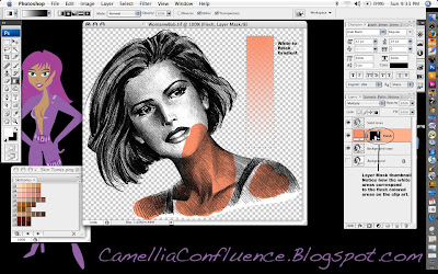
Now, go ahead and paint in the entire flesh area. Use a larger brush size on large areas and decrease the brush size in areas where detail is critical, like around the eyes and lips.
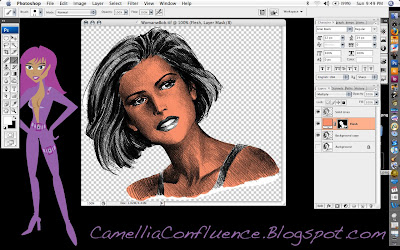
Some things to know about adjustment layers:
1. If you paint into an area accidentally, switch the foreground color to black and paint over the mistake. The black paint will act like the eraser tool in a mask.
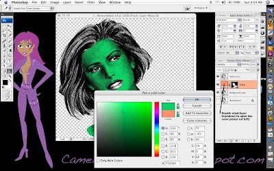
2. What if you don’t like the color you just painted in? No need to worry, this is one of the strengths of adjustment layers. Just double click on the layer thumbnail and a color picker will pop up. Select whatever color you want. You can change it as much as you want and it will not affect any other layer in the image. (See screenshot below.)

Now, keep adding Solid Color Adjustment Layers for each color you want to add to the line art.

Steps in making a new Solid Color Adjustment Layer:
1. Click on the Adjustment Layer Icon on the bottom of the Layers Pallet.
2. Select Solid Color option
3. Choose your color from the color picker
4. Rename the layer (I use Eyes, Lips, Hair, etc.)
5. Change the layer mode to Multiply
6. Fill the layer with black
7. Paint the areas you want to be in color with white using the Paint Brush Tool.

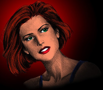
When you are finished, your colored line art will look similar to the one I did below.
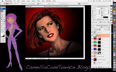
To finish off the picture you may want to make some adjustments to the Solid Lines layer. In the image above, I changed the mode to Multiply and reduced the opacity to 67 percent so the solid lines weren’t so overpowering.

I used a red and black circular gradient to provide a simple background as well. To give the clip art a vignette look, I airbrushed the lower right corner in a very thin layer of black using a 300-pixel brush with 0 percent hardness and 30 percent flow. This is the Vignette layer just below the Solid Lines Layer in the screenshot.

You’ll also have some pesky white areas on the “Background copy” layer. I used the Brush Eraser tool with a 20-pixel radius and 0 percent hardness to carefully erase those areas.

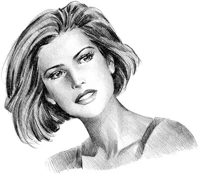
Original Source File:


Adobe Illustrator Skintones Swatch: