This year, I'll post a weekly photography tutorial on Tuesday. I decided to write the tutorials because I believe it's always a good idea to review photography fundamentals, rules and techniques. When I review some of the very basics of photography and brush up on techniques I don't normally used very often, I found I get a lot of new ideas. I hope people will find these tutorials informative and useful.
The topics I will be covering for the first quarter of 2009:
January 2009
January 6, 2009: RAW vs. JPG
January 13, 2009: Aperture and Shutter Speed
January 20, 2009: The Sunny 16 Rule
January 27, 2009: Determining Exposure
February 2009
February 3, 2009: Selecting Equipment
February 10, 2009: Benefits of a Tripod
February 17, 2009: Essential Filters
February 24, 2009: Useful Gadgets
March 2009
March 3, 2009: Basic Composition
March 10, 2009: Image Power Points
March 17, 2009: Perspective
March 24, 2009: Depth of Field
March 31, 2009: High Dynamic Range (HDR) Images
Monday, December 29, 2008
2009 Artwork
For The Confluence, I bundled all my completed creative projects — Phototshop, Illustrator, Photographic Illustrations and Drawings — into a a general artwork category. All of my 2009 Artwork projects can be accessed through this page.
January
xxx
Notes:
2008 Archive
January
xxx
Notes:
2008 Archive
2008 Archive
2008 Blog Entries
Photography
This is a chronological listing of all posts I've made on photographic field trips, which I'm calling excursions.
January 2008
Jan. 12, 2008: Magnolia Cemetery
Jan. 12, 2008: Time Lapse Experiment #1
Jan. 21, 2008: HDR Headaches
Jan. 26, 2008: Pike Piddler's Storytelling Festival
February 2008
Feb. 2, 2008: Greenville & Georgiana
Feb. 14, 2008: Viscosity Experiment 001
Feb. 16, 2008: Greenville on Foot
Feb. 28, 2008: Gummy Bear Zen Masters
March 2008
March 15-16, 2008: Road to Cheaha
March 23, 2008: Brundidge to Greenville
September 2008
September 11, 2008: Commerce Street, Greenville
September 22, 2008: Magnolia Cemetery at Sunset
November 2008
November 7, 2008: Come Home It's Suppertime
December 2008
Sunday, December 7, 2008: Troy University Football
Sunday, December 7, 2008: Winter in Greenville
Notes:
Excursions Notes
###
Sunday, December 7, 2008
Winter in Greenville
I took drive around downtown Greenville late this afternoon to shoot a few shots. I wanted to concentrate on a winter in town theme. Since it was a bright, sunny day with a temperature around 50, I decided to concentrate on leaves and shadows.
The photo above was my favorite shot of the day. I find shadows to be an interesting subject to shoot. And this time of year is perfect for shooting shadows since the sun is lower on the horizon at this time of year.
Some more of the photos I took with the winter theme are on Flickr.
Troy University Football
Things are always busy at newspapers around Thanksgiving and Christmas because of all the additional seasonal advertising. So, it took me a couple of weeks to get around to sorting through all the photos from Troy University's homecoming game against Western Kentucky University. Troy Beat Arkansas State yesterday to win the Sun Belt Conference Championship outright. With the win the Trojans god a bid to the R+L Carrier Bowl in New Orleans Dec. 21.
I may try and make it to the game, but it's on an odd day of the work week, so I won't know how that is going to pan out with my work schedule. I probably won't get a holiday schedule until later this week.
I need to add a few additional game shots and the halftime and homecoming festivities to my set on flickr.com.
Sunday, November 23, 2008
Come Home, It's Suppertime
Every fall and spring, I shoot promotion photos for the Brundidge Historical Society's original folklife play, "Come Home, It's Suppertime." The play revolves around stories handed down from the Brundidge, Alabama, area during the Great Depression. Since it is a community theater production, the scenes in the play change during each season of performances based on who is available to perrform.
The photo above is from a new scene in which Rebecca Brown and Alexis Fraley learn to kiss from a "True Confessions" magazine.
The Brundidge Historical Society will also be presenting Sheila Kay Adams for a "Tell it on the Mountain" Chrustmas storytelling Dec. 12 at the We Piddle Around Theater in Brundidge, Alabama; present the Pike Piddlers third annual Storytelling Festival Jan. 20-31, 2009, at the We Piddle Around Theater and Trojan Center Theater on the campus of Troy University; and Barbara Bates Smith as Ivy Rowe from Lee Smith's novel, "Young and Tender Ladies," June 11, 2009.
I posted several other photographs on Flickr.
See the Brundidge Historical Society's website for more information.
Thursday, September 25, 2008
Life as a Wallbanger: The Brats

The three characters in the wallpaper are Abbigale, Victoria and Elizabeth — The Brats in a four panel cartoon I'm developing called Life as a Wallbanger. It's about a dysfunctional family and centers around the life of the two-year-old, Harvey. Harvey's mission in life is to evade his evil sister, Victoria, rule his daycare and force the square peg into the round hole.
Victoria was the first character in the Wallbangers I designed. Her life ambition is to torment her brothers, bamboozle her parents and to use her friends in nefarious plots to rule middle school. Victoria always refers to herself in the third person and has two friends, Abbigale and Elizabeth, that follow her every order.
Abbigale and Elizabeth were designed to closely resemble Victoria and are really Victoria Wannabees, that's why all three characters look so similar. I wanted to focus on the wannabe aspect of Abbigale and Elizabeth, so their clothes will always match Victoria's exactly. They play a very minor role in the Wallabngers, so they don't appear very often. They apear early in the comic for introduction, After that, they appear mainly in support of Victoria's plans to rule middle school with an iron fist.
Victoria is the only character in the Wallbangers that has two versions. The evil version is shown in the wallpaper. Whenever Voctorial appears in the presence of her parents, she's drawn as a sweet little girl. In that version, her face is more round and her pony-tails are rounded and not drawn with sharp angles. She also has big doey eyes and there are no sharp angles anywhere on the character.
However, when she appears with other adults, she always appears in the evil version because other adults see her for what she really is, a spoiled little brat.
The three brats are the first characters introduced in the comic. They're bored and decide to take Harvey "Baby Bowling."
Labels:
Abbigale,
Elizabeth,
Huck,
Victoria,
Wallbangers
Monday, September 22, 2008
Magnolia Cemetery at Sunset

Sunday, I had to go in and do some work at The Greenville Advocate. I was leaving about 6:15 p.m. and saw some beautiful cloud formations. I decided to shoot some silhouettes of the grave markers in Magnolia Cemetery. The oldest part of the cemetery is tucked away in a wooded area, so the opportunity to shoot a silhouette is rare. There are only a couple of graves in a clearing overlooking the remainder of the cemetery that are clear of the treeline.
The cemetery is one of my favorite places to shoot in Greenville. The older section of the cemetery dates back to the Civil War era, possibly earlier. There was one particular grave marker that I'd wanted to shoot for a while. I was just waiting for a good sunset.
I shot around the cemetery while I waited for the sun to begin setting. When the sun started getting close to the top of the tree line, I set up my tripod and waited. After about 20 minutes, I started shooting. This shot was near the end of a sequence of about 40 shots spaced about 30 seconds apart.
The image is a tone-mapped RAW file. I had to boost the saturation a little more than normal because Picasa tends to flatten out images when they're uploaded to blogger.
Labels:
Alabama,
Greenville,
Huck,
tone mapping
Thursday, September 11, 2008
Commerce Street, Greenville

As I was leaving work last Monday I noticed a heavy thunder could was moving in over Commerce Street in Downtown Greenville. I managed to shoot off six or seven sets of bracketed exposures (-2/0/+2 Stops) and then used FDR Tools to merge everything into a HDR image.
That didn't work too well. The wind was blowing really bad and I got a lot of ghosting in the clouds and bushes on the left side of the frame. In the end, I ended up tone-mapping the middle exposure in one of the brackets to expose the buildings and bushes. I used the under exposed frame and tone-mapped the sky.
After that, I created a mask around the buildings and shrubs and erased the sky from the exposure with the building and shrubs. That allowed the sky on the layer below to show through.
After that I cleaned up some dust spots and removed a traffic light that was sticking up out of the middle of the bushes. It was a really distracting element because it went right through the middle of the dark cloud.
Overall, it took about three hours to finish the post processing on the merged photograph.
(Note: HDR imaging, DRI imaging and Tone Mapping require RAW image format. You can't technically create a HDR, DRI or tone-mapped image from a JPEG or any other file type. Only RAW format keeps all of the luminosity data when the image was taken. Other file types have algorithms that determine how much of the captured data is saved in order to compress the file before saving.)
Sunday, August 24, 2008
New Retro Style Cartoons

I picked up a copy of Christopher Hart's Cartoon Cool: How to Draw New Retro-Style Cartoons a couple of weeks ago. The style is based on cartoons from the 1950s and 190s, but has a more modern flair.

If you've seen any of the Erin Esurance commercials, you'll recognize the style. But, the style really reminds me of Betty Boop. The Betty Boop films ran from 1932-1932 and were produced my Max Fleischer and released by Paramount Pictures.
Betty was an overtly sexy character for three years, but restrictions placed on the motion picture industry regarding sexuality caused Betty Boop to be toned down.
However, she was the first and most famous animated sex symbol and still remains popular today.
I really like this style because it's fun to draw. But also because one of the mainstays of this style is that it is centered around a family or group of people that are self-centered, irreverent and dysfunctional. In that way it reminds me a lot of South Park.
All that aside, I'm still learning to draw the style. I've been following along with the examples and practicing. The scan from my sketchbook is some of the practice. I'm beginning to understand how this style is drawn. I'm planning to start developing my own characters soon for a comic strip entitled "Life as a Wallbanger." It's about a dysfunctional family "somewhere in America."
Labels:
"Huck's Drawings",
cartoon,
Huck,
new retro,
sketchbook
Saturday, August 23, 2008
Thursday, August 21, 2008
Chooser of the Slain

I've always found the Valkyries from Norse Mythology rather interesting. Valkyries, minor female deities that served Odin, chose the souls of warriors killed in battle to take to Valhalla to fight beside Odin in Ragnarok.
I decided to create a rendition of a Valkyrie in Illustrator, and started with a concept of the Valkyrie looking over her right shoulder with a weapon in her right hand. I wanted the right shoulder open and her hair to flow so that it looked like she turned suddenly and looked at the viewer.
I work better with a photo reference for body positioning. But, my Comic Artists Reference didn't have a pose close to anything I wanted. After looking through dozens of anime magazines and manga and not finding a close approximation of the pose, I looked at anime wallpapers on the Internet.
I finally found a wallpaper of a character from Neo Ranga that was almost exactly the pose I had in mind. I worked up a rough sketch and refined it several times before I started adding details. Originally, the Valkyrie had armor, earrings and other jewelry. But, I developed a pretty elaborate body tattoo and decided to make the Valkyrie naked so all of the tattoos could be seen.
Her weapon was originally a recurve bow, but I changed it to an over sized boomerang. I decided on a boomerang because the Valkyrie could throw it and the boomerang would return with the soul of her chosen slain warrior. The boomerang also gave me a larger pallet to draw a pattern similar to her tattoos.
After I completed the drawing, I scanned it and did the inking and cell shading in Adobe Illustrator. I had done some work in Adobe Photoshop for the background. I created a star field for the night sky, but decided it overpowered the drawing. So decided to go with the original background from Illustrator.
My original Illustrator document is 11x14 because that's the largest size print I can have made locally. I resized it to make a wallpaper for my laptop, which is the wallpaper that accompanies this blog entry.
Total working time was about 30 hours to complete the project. It took me about two hours to draw it and about four hours in Illustrator. The rest of the time was spent developing the tattoo pattern and pattern on the boomerang. I did about 14 or 15 variations of the tattoos before I settled on something I really liked.
Labels:
"Huck's Drawings",
Huck,
Valkyrie,
Wallpaper
Wednesday, August 6, 2008
Shading Practice: Motoko

After a couple of weeks of practicing pencil shading, I decided to try and put everything together. I found a wallpaper of Aoyama Motoko from Love Hina. I need to get a better scanner. It did a really poor job of accurately copying the drawing.
It darkened a lot of the background and other parts of the drawing, the lines around the wristbands most notably. The scanner also blew out the highlights. I fiddled with the exposure on the scanner, but it didn't make much difference in any of the other scans.
I was pretty happy with the actual drawing, though there is a lot of room for improvement. I wasn't very happy with the way it scanned though.
Labels:
"Huck's Drawings",
Huck,
Motoko,
Pencil
Thursday, July 31, 2008
Chelsea in Electric Blue

Life in general has been pretty busy the last couple of weeks. None-the-less, I managed to squeeze in some work in Illustrator. For some reason, I'm kind of hooked on the style of artwork Esurance uses in its commercials.
It took me about four hours to complete the wallpaper. I based the girl, I'm calling her Chelsea, off of a rough sketch in my sketchbook. I scanned it in, placed it in Illustrator and then used the pen tool to trace it. About half of the time it took to finish the piece was spent on the hair. I t took me a while to reach a result I was happy with.
I'm going to let the project rest for a few days and then take a look at again. I'd like to add some more highlights to give it an extra dimension. And I'll probably use Photoshop to do some more detailed shading on the face.
Labels:
Chelsea,
Drawings,
Huck,
Illustrator,
Wallpaper
Sunday, July 13, 2008
Coloring Line Art with Adjustment Layers
In this tutorial we’ll be using Adjustment Layers to color the line art. Adjustment layers are one of the most powerful, and probably least used, features of Photoshop. To create an adjustment layer, open your layers pallet and click on the half-black/half-white circle at the bottom of the pallet. In this tutorial we’ll only be using the first option, solid color (See the image below).
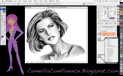
More on adjustment layers later. Open your line art in Photoshop. (The source image and a copy of the Illustrator Skin Tones Swatch are included at the end of the tutorial. If you wish to follow along with those images, scroll down and Right+Click on each image and select Save As). Make sure the image is in RGB mode (Image -> Mode -> RGB Color) before we begin.
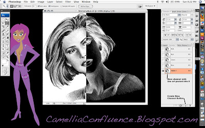
The first thing we’re going to do is preserve the details of the lines in a separate layer using an alpha channel. To do this, select the background layer in the layers pallet. The Select All (Cmd+A) (Note: I’ll be using Mac shortcut commands in this tutorial. If you’re using a PC, use the Ctl key instead of the Cmd key). Then copy the selection using Cmd+C.
Now, Cmd+Click on the Alpha 1 channel icon and anything white will be selected. In order to be able to select the black lines, we need to invert the image, or flip-flop the colors. Use Cmd+D to drop the selection, then Select All, Cmd+A, and use the Image -> Image -> Adjsutments -> Invert (Cmd+I) and the image will be inverted. Cmd+Click on the layer again to select the white lines.
 Now, switch back to the layers pallet and click on the background layer. In the layers pallet, create a new layer by clicking on the Create Layer icon at the bottom of the pallet. The new layer will be called Layer 1 by default. You can double-click on the layer name to rename it. I renamed my Layer “Solid Lines.”
Now select Edit -> Fill and choose Black from the pull-menu in the Contents portion of the dialogue.
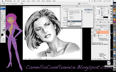
You can click on the “Eye” icon on the background layer to turn it on and off in order to better see what the “Solid Lines” layer actually consists of.
You can also use the “New Layer Icon” to duplicate an existing layer. For the next step, we need to duplicate the background layer. So Click+Drag the background layer onto the “New Layer Icon.” The layer created will be called “Background copy.” I left the name unchanged for the tutorial, because that’s what I would have called the layer anyway.
The final preparation step before painting is to remove the white background from the “Background copy” layer. Use the Magic Wand and Lasso selection tools for this step. Then delete the selected areas.
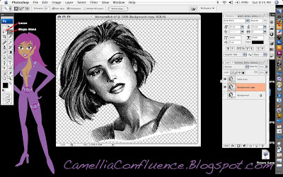
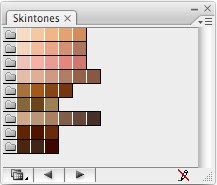
Now, we’ll start adding color one layer at a time. I always begin with the flesh layer. I have a screenshot of the Adobe Illustrator skin tones color swatches I keep hand. I used the eyedropper tool to sample one of the flesh tones.
Once you have your color chosen, selected the adjustment layers icon (the half-black/half-white circle at the bottom of the layers pallet) and chose the Solid Color option (the first one) from the pop-up menu. By default, the color of the adjustment layer is the same as the foreground color. See the image below.
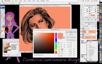
Solid color adjustment layers act like a mask. Any portion of the layer that is white appears as a solid color, Anything black is completely masked. Shades of gray allow a portion of the color to show through.
Now, if you notice in the screenshot above, the entire layer is flesh colored. That’s because the layer is filled with white. Now Select All (Cmd+A) and then Edit -> Fill and use Black.
The adjustment layer now becomes completely transparent. In order to get the color to show through, we have to use the Paint Brush tool and paint in areas of white where the flesh is. In the image below, I’ve painted portions of the flesh and drawn a white to black gradient in a rectangular selection marquee. Look at the gradient and you’ll notice how shades of gray reveal increasingly transparent shades of the flesh color.
Remember though, we want the detail in the background image to show through as well. So change the Layer Mode to Multiply to reveal this detail.
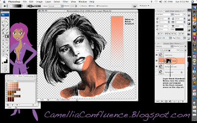 Now, go ahead and paint in the entire flesh area. Use a larger brush size on large areas and decrease the brush size in areas where detail is critical, like around the eyes and lips.
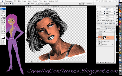 Some things to know about adjustment layers:
1. If you paint into an area accidentally, switch the foreground color to black and paint over the mistake. The black paint will act like the eraser tool in a mask.
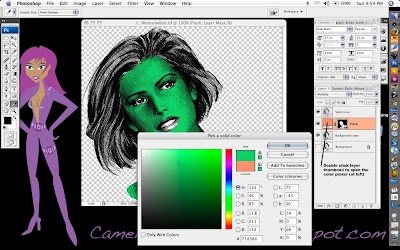
2. What if you don’t like the color you just painted in? No need to worry, this is one of the strengths of adjustment layers. Just double click on the layer thumbnail and a color picker will pop up. Select whatever color you want. You can change it as much as you want and it will not affect any other layer in the image. (See screenshot below.)
Now, keep adding Solid Color Adjustment Layers for each color you want to add to the line art.
Steps in making a new Solid Color Adjustment Layer:
1. Click on the Adjustment Layer Icon on the bottom of the Layers Pallet.
2. Select Solid Color option
3. Choose your color from the color picker
4. Rename the layer (I use Eyes, Lips, Hair, etc.)
5. Change the layer mode to Multiply
6. Fill the layer with black
7. Paint the areas you want to be in color with white using the Paint Brush Tool.
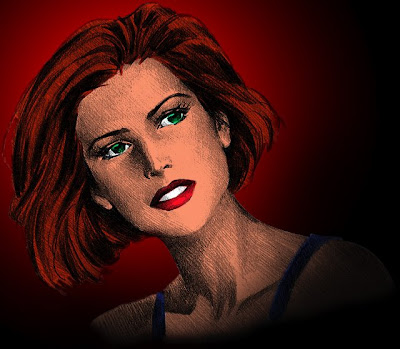
When you are finished, your colored line art will look similar to the one I did below.
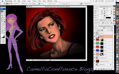 To finish off the picture you may want to make some adjustments to the Solid Lines layer. In the image above, I changed the mode to Multiply and reduced the opacity to 67 percent so the solid lines weren’t so overpowering.
I used a red and black circular gradient to provide a simple background as well. To give the clip art a vignette look, I airbrushed the lower right corner in a very thin layer of black using a 300-pixel brush with 0 percent hardness and 30 percent flow. This is the Vignette layer just below the Solid Lines Layer in the screenshot.
You’ll also have some pesky white areas on the “Background copy” layer. I used the Brush Eraser tool with a 20-pixel radius and 0 percent hardness to carefully erase those areas.
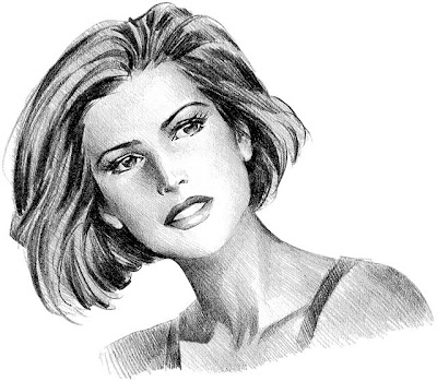
Original Source File:
Adobe Illustrator Skintones Swatch:
Labels:
Addie,
Cinnamon Girls,
Colored Line Art,
Huck,
Photoshop,
Tutorial
Friday, July 11, 2008
NFL Cheerleaders
NFL Cheerleaders. Enough said. I may eventually get around to doing all the teams, but it's not a real high priority. These are kind of boring to do. All of the costumes are basically very similar just the color schemes are different.


Labels:
Aireanna Nishi,
Avatar,
Clothes,
Huck,
Nishi's Unlimited,
Second Life,
Skins
Thursday, July 10, 2008
Super Hero Girl - Stilletto

This is a cross between a Tandy Bowen's, from Cloak and Dagger, and Supergirl's Costumes with some black stockings, gloves and a few puffy arm and leg bands thrown into the mix.
One night "Superhero Girl" by Eve 6 played on iTunes and I thought, that'd be a cool costume, so I stopped whatever I was doing and skinned this in about an hour. I based the costume on what I remember Dagger's and Supergirl's costumes looked like when I was a kid and still had time and money to read comics.
Bah, I miss those days.
Labels:
Aireanna Nishi,
Avatar,
Clothes,
Huck,
Nishi's Unlimited,
Second Life,
Skins
Nishi's Racing Modelwear 001

I made these outfits based on Race Queens in Asia. Race Queens are pretty much banned from tracks in America because of the highly suggestive costumes and for safety reasons. However, In Japan, most Race Queens are pop idols and almost as an important part of the race team as the driver. They act as promotional models and can draw huge crowds to promotional events, such as car shows. It is ironic that an American Company, Hawaiian Tropic, started the Race Queen craze in 1983 at 24 Hours of Le Mans.
The practice of using promotional models at car shows is prevelent in the United States. These models are usually associated with the street racing or import scene. For example, Import Tuner Magazine keeps a running list of the models that pose with cars for their stories.
Andrea Bagnall (photo) seems to be my favorite domestic car show model.
Back to the SL portion of the post, for some reason people really seemed to like these outfits. I had several people want copies of the outfit in custom colors. Six color variations are shown below, but I probably did about 10 different colors.
I did two a Tony Stewart and two other Nishi Racing outfits. I don't seem to have any screen shots of those costumes though. My wireless router is being quirky, so Second Life keeps booting me because of timed out connections. When I get that fixed I'll log on and take some screens of those.

Labels:
Aireanna Nishi,
Avatar,
Clothes,
Huck,
Nishi's Unlimited,
Second Life,
Skins
Naughty Nurse

Every self-respecting female avatar needs a naughty nurse outfit. Hmm. I need to get around to doing a French Maid outfit one day.

Labels:
Aireanna Nishi,
Avatar,
Clothes,
Huck,
Nishi's Unlimited,
Second Life,
Skins
Modern Witch

This is probably my favorite costume. I wanted a new outfit for Halloween 2007, I decided on a witch costume. I didn't really have a concept for the clothing, I just wanted it to look sexy. So, I just sat down with Photoshop one night and banged out the textures.
I decided to go with a basic school girl/stripper concept with lots of fishnet, fake fur and jewelry. The only part of the costume that was difficult to build was the hat. To make the fur required a lot of prims. I'll have to look at the object's prim count one day, but I suspect there are close to 300 prims in the hat alone.
Labels:
Aireanna Nishi,
Avatar,
Clothes,
Huck,
Nishi's Unlimited,
Second Life,
Skins
Leslie's Tartan

This was the first set of clothing I ever made in Second Life. The only thing even remotely special is that the Sunglasses are actually part of the hair attachment. The root prim is the bridge of the glasses, combining the two attachments freed up an extra attachment point for jewelry (like a nose ring or lip ring).
Before I reopen Nishi's I may go back and script the glasses so you can select what color rims/lenses you want in them.
Labels:
Aireanna Nishi,
Avatar,
Clothes,
Huck,
Nishi's Unlimited,
Second Life,
Skins
Leslie's Party Dress

I put this ensemble together just after I finished the Leslie's Tartan set. Female avatars are supposed to have a black dress right?
This was really simple to build. I just repainted the textures and hair from the previous outfit and added in a variation of the corset from the tartan.
Labels:
Aireanna Nishi,
Avatar,
Clothes,
Huck,
Nishi's Unlimited,
Second Life,
Skins
FFX2 Yuna - Gunner

The Final Fantasy X2 outfits were exceptionally difficult to reproduce. The level of detail in them took a great deal of time to reproduce. There were also a tremendous amount of textures that I had to build to capture all of the detail.
I've seen a lot of variations of this outfit in Second Life, and I honestly think this is the most accurate rendition of the Yuna Gunner Dresssphere Costume in the simulation. The most problematic detail in the whole costume was that Yuna's character has different colored eyes. I had to texture a blue and green eyeball then, map that onto a hollow half-sphere prim and attach them to the avatar eyeballs. That was tedious work.
I want to do Yuna's Dark Knight Dressphere Costume as well, but that is going to a take a while to build. I don't even want to think about the number of prims it will take to make that suit of armor.
Labels:
Aireanna Nishi,
Avatar,
Clothes,
Huck,
Nishi's Unlimited,
Second Life,
Skins
FFX2 Rikku - Thief

This was a rather fun, but frustrating FFX2 costume to reproduce. I had to build the swirled-pupil eyes of the Al Behd, but I was able to texture map them onto the eyeballs because both eyes were the same.
The difficult part of this costume was recreating all of the flexible fabric in it. The skirt, bows on the arms and scarf are all flexible. It took a lot of meddling with each prim's gravity to get the outfit to flow realistically when the avatar moves.
The hair was a real pain in the ass to build because Rikku had so many braids and colored beads. Not to mention the scarf wrapped around her head. This costume is accurate from her head to her shoes. The only thing I couldn't duplicate was flexible hair braids. When I built the outfit, Second Life didn't have the capability to attach a solid prim to a flexi prim and have them move in concert.
This is one of my more favorite costumes.
Labels:
Aireanna Nishi,
Avatar,
Clothes,
Huck,
Nishi's Unlimited,
Second Life,
Skins
Abby's Fishnet

I like to watch NCIS, so I decided to do a line of gothic clothing and name it Abby, after the character on the show. The outfit has a lot of fishnet, studded bands and barbed wire. A perfect outfit for a night in the mosh pit.
Labels:
Aireanna Nishi,
Avatar,
Clothes,
Huck,
Nishi's Unlimited,
Second Life,
Skins
Abby Gothic

 This is a pretty racy costume. I based it on some photos of Bianca Beauchamp, left, (official website), then took a lot of liberty with the whole latex concept. There's a lot of transparency in the shirt and skirt. The costume uses the actual skirt mesh from Second Life, but I added the transparency with textured TARGA files. The skirt is as short as I could make it and still have it look like a skirt.
This is the second costume in the Abby line, inspired by Abby on NCIS.
The costume also contains a tremendous number of prims in the attachments as well as flexi prims in the armbands. The boots are similar to the ones from Abby's fishnet, but they have more studs.
This is also the first scripted costume I designed to sell. All of the attached objects have a "Bling Script" embedded in them. If you're not familiar with Second Life, Bling Scripts make the prims sporadically emit a brief starburst, like a light source reflecting off gold or silver.
I also included an earring that has an animation override script in it. The AO override script, prevents the avatar from using the default "at rest" pose and instead cycles through five other model-stance poses.
I think this is my best designed outfit, but still it's not my favorite.
Labels:
Aireanna Nishi,
Avatar,
Clothes,
Huck,
Nishi's Unlimited,
Second Life,
Skins
Nishi's Unlimited

One of my Second Life avatars, Aireanna Nishi, once ran a clothing store in Second Life called Nishi's Unlimited. Due to the fact I've been extremely busy in 2008, I closed Nishi's Unlimited in January. The screenshot above is from the shop I was running in Dakari Coast Estates at the time. I still get occasional messages from people that purchased clothes from me, so I may reopen the store this fall.
Check this page in September or October of 2008 if you are interested in purchasing any of these clothes. You can also usually find my avatar in the Sand Box at Ed Tech or at Abbott's Aerodrome. I love virtual skydiving.
Labels:
Aireanna Nishi,
Avatar,
Clothes,
Huck,
Nishi's Unlimited,
Second Life,
Skins
Second Life Clothing
Ever since The Sims came out, I've been fascinated with skinning character models. So, from time-to-time, I skin clothing for avatars in Second Life. At one point I opened a clothing shop, Nishi's Unlimited, but got too busy to keep it running in the simulation.
I decided to post some advertising shots from the shop for each set of clothing I designed. Over the Fourth of July weekend, I got the urge to work on some new outfits. I plan reopen Nishi's in the fall when I'm not so busy in real life.
Products Available will be:
Abby Gothic
Abby's Fishnet
FFX2 Rikku - Thief
FFX2 Yuna - Gunner
Leslie's Party Dress
Leslie's Tartan
Modern Witch
Naughty Nurse
NFL: (Houston, Jacksonville, Tampa Bay)
Nishi's Racing Modelwear 001
Super Hero Girl - Stilletto
Labels:
Aireanna Nishi,
Avatar,
Clothes,
Huck,
Nishi's Unlimited,
Second Life,
Skins
Wednesday, April 2, 2008
Puzzle Pirates
I really enjoy puzzles. There's something I find rewarding about completing a puzzle. I like the traditional, 1000+ piece puzzles. I'm currently working on a puzzle of the Titantic. However, the photo on the box doesn't depict the actual puzzle. So it's been extremely difficult to put together.
I also enjoy puzzle-style video games, like Snood and Tetris.
I was reading tv.com's Terminator: Sarah Conner Chronicles message board to see if TSCC had been renewed for a second season. I don't normally pay attention to ads, but one for PuzzlePirates.com caught my eye.
It's a Massive Multi-Player Online Role Playing Game. Conflict and task resolution is resolved by completing puzzles. The better the score on the puzzle, the better the outcome for your pirate. The flash widget above shows my particular pirate. She's in the clothing she started with. Commissioning a new portrait will cost me 15,000 pieces of eight (the game money). 've spent all the money I pillaging on new clothing, a house and various storage items and weapons. I've purchased everything I need (except a ship) so I can now start spending money on conspicuous stuff, like a new portrait.
The game really revolves around playing an actual pirate. You carouse, play cards, drink, brawl and sword fight. Then set sail and pillage and explore new lands.
It's a really fun game to play when you have the time for it. It's also a very deep game. There are special events, monster hunts and all of the elements of a traditional MMORPG.
The game is free to play. But, you have to subscribe to have access to all of the puzzles on a daily basis as well as own specific items. If you don't want to subscribe, most of the puzzles are free to play on certain days.
Overall, this is a pretty fun game. But, like any MMORPG, it can be a massive time sink. I used to play FFXI and completed the quest for Lu Shang's Rod. So I know what a time sink is.
The nice thing about this game is that there are puzzle tournaments and tables where you can issue puzzle challenges.
So, when I've got some free time, I log on and issue a challenge or join a tournament. When the game starts, you get a nice little whistle sound. So you don't have to stay glued to your computer.
Monday, March 24, 2008
March 23, 2008: Brundidge to Greenville

I went home for Easter and decided to take the long way back home — Brundidge-Troy-Goshen-Glenwood-Luverne-Greenville. All in all, it was a pretty disappointing trip. I found a few nice structures to shoot, but they were all facing east and back lit so bad I was getting glare on the front element of my lenses.
The most interesting structures I could find were churches. Unfortunately, there wasn't a cloud in the sky, so there wasn't really anything dramatic about the shots. I went ahead and shot the buildings for reference and marked them on my map. On an afternoon when I have decent cloud cover, I'm planning to head back east and shoot those buildings. I can make it to Luverne and Glenwood in 25-30 minutes.
Since I wasn't getting anywhere photographically wise, I decided to head back to Greenville and shoot some wildflowers. I had covered all the wildflowers I could find earlier in the week, but they were wet and the sun had come out, so I got really bad burned our areas in some of the droplets. I decided to shoot the flowers dry, but the wind was blowing so bad I had to abandon that as well.
I ended up just going in to work to get get a jump on Monday's workload. Overall, it was a really frustrating trip. But, sometimes it goes that way.
Tuesday, March 18, 2008
March 15-16, 2008: Road to Cheaha

I'm finally settled in at my new apartment for the most part. But, I still have a lot of unpacking to do. I've really put that on the back burner though. I have a roof over my head and food to eat. I don't really care if it's cluttered with unopened boxes.
I have better things to do right now. It's spring and the weather is warming up and the days are getting longer. I made an excursion to north Alabama to Cheaha State Park this past weekend. I really wanted some new scenery.
I took a long route to get to Cheaha because I wanted to go through downtown Montgomery to check it out for photo opportunities. You never know what lies along a road until you travel it.
I took these two images in Rockford on the way to Cheaha:
I was working on doing realistic HDR as opposed to all of the cartoonish/drawing style post processing I've been working on so far this year.
The first image was of waterfalls along the Highfalls Trail in Cheaha State Park. The next two are as described. All three are three images are HDR bracketed at -2/0/+2 EV.
The waterfall shot is all HDR. The cemetery and church shot are HDR masked over a tonemapped middle image in the bracket. There was some bad haloing caused by FDR tools. So I had to do a lot of masking to remove those halos.
The other photos I posted on Flickr have the North Alabama tag.
Overall, I was pretty happy with the trip. Some Flickr members liked the photos and others have been critical of them. But, I like the criticism. Most of it has been very helpful. If I want to keep expanding and improving my skills, I have to be open to criticism, whether it be positive or negative.
Wednesday, March 12, 2008
Tutorial: The Orton Effect

I decided to write a tutorial on the Orton Effect because I couldn't find any that went into any real depth. The explanations of the tutorial were basically limited to do this and do that. Since this is a pretty popular photo effect, I though it would be nice to write a fun Photoshop tutorial in graphic format to illustrate this technique.
Each "page" is linked to a larger, easier to read screen shot. You can also download the tutorial in PDF format here.


Subscribe to:
Comments (Atom)


